WBBSE Solutions For Class 8 Maths Chapter 2 Pictograph And Pie Chart
Pictograph and Pie Chart Introduction
When we randomly receive some data we feel difficulty in studying and comparing it. But when the data are arranged in systematic order and represented through figures/pictures we can understand it easily. For this purpose, drawing pictographs plays an important role in communicating various information as well as comparing different data with others. Let us draw some pictographs.
WBBSE Class 8 Pictograph Notes
Drawing of pictographs
To draw pictographs, certain symbols, representing particular data are used. Depending upon the extent of the data received, we use the symbols to have a particular meaning or designation. In other words, depending on the size of the data we assign a pre-determined symbol to indicate a specific number so that the data supplied in a problem may be represented by that symbol. Sometimes, half of such a symbol indicates half of a number valid for a total/full symbol.

Read And Learn More WBBSE Solutions For Class 8 Maths
Chapter 2 Pictograph And Pie Chart Some Examples
Example 1
You have worked out the following number of sums during the seven days of a week.
Monday- 8,
Tuesday- 5,
Wednesday- 0,
Thursday- 6,
Friday- 5,
Saturday- 4,
Sunday- 7.
Describe the above data with the help of a pictograph.
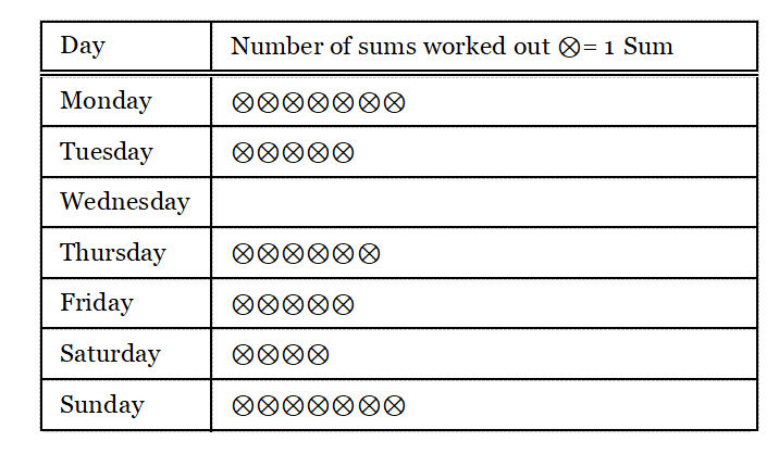
From the above pictograph we can conclude the following:
1. You worked out the highest number of sums on Monday.
2. You did not work out any sum on Wednesday.
3. You have worked out an equal number of sums on Tuesday and Friday.
Example 2
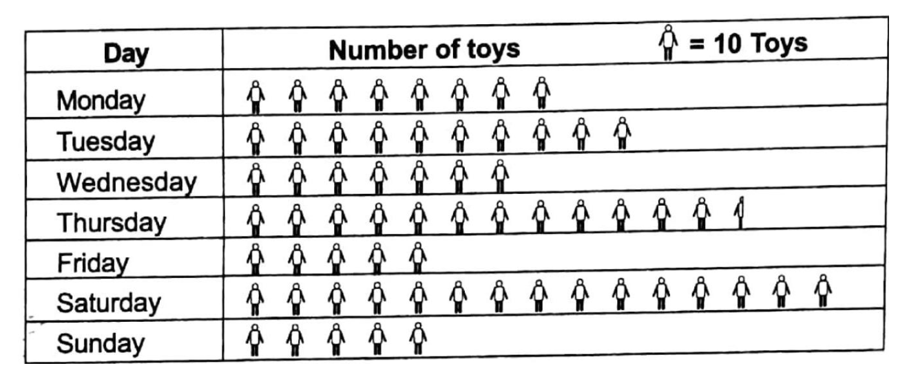
A toy manufacturing company has prepared toys as shown by the following pictograph.
Watch the following questions and answers
Question 1. How many toys have been manufactured on Friday?
Answer.
On Friday
5 x 10 toys
= 50 toys.
50 toys have been manufactured on Friday
Question 2. On which day the maximum number of toys have been manufactured and how many?
Answer: On Saturday. The number of toys manufactured is 15 x 10 toys = 150 toys.
Question 3. On which days an equal number of toys have been manufactured?
Answer: On Friday and Sunday.
Question 4. How many more toys have been manufactured on Saturday than on Thursday?
Answer: On Saturday 15 x 10, toys = 150 toys have been manufactured.
On Thursday (12×10+1×5) toys = 125 toys have been manufactured.
∴On Saturday (150 – 125) 25 more toys were manufactured.
Understanding Pie Charts for Class 8
Example 3
The following pictograph shows the number of students who passed the different classes in the Annual Examination 2012.
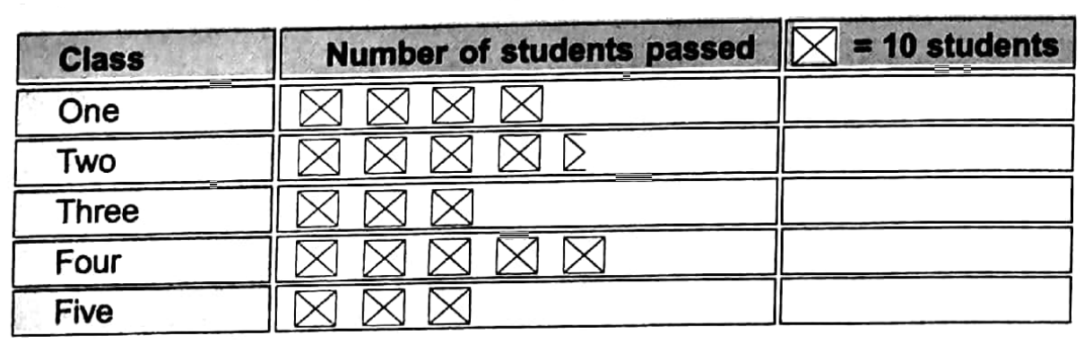
From the above pictograph we may conclude the following:
Solution:
1. Number of students passed in class two = 4 x 10 + 1 x 5 = 40+ 5 = 45
2. The highest number of students passed in class four and their number = 5 x 10 = 50
3. The number of students who passed in class three and class five is equal. This number = 3 x 10 = 30
Example 4
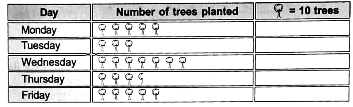
A Pictograph of the number of trees planted by the students of your class is given below :
Watch the following questions and answers
Question 1. How many trees have been Q. planted on Thursday?
Answer: (3 × 10+ 1x 5) trees = 35 trees.
Question 2. On which day the maximum number of trees were planted and how many?
Answer: On Wednesday. The number of trees planted = 7 x 10 = 70 trees.
Question 3: On which days an equal number of trees were planted?
Answer: On Monday and Friday.
Question 4. How many more trees were planted on Wednesday than on Tuesday?
Answer: On Wednesday 7 x 10 = 70, trees were planted.
On Tuesday 3 x 10, 30 trees were planted.
∴ On Wednesday (70-30) 40 more trees were planted.
Horizontal Bar graph
Sometimes data may be represented by a horizontal bar graph. For example, if we express example 4 given above by horizontal bar graph it looks like this

Step-by-Step Guide to Creating Pictographs
Example :
A horizontal bar graph is drawn showing how many students out of a total of 40 students help with their household work (in hours) during holidays. From this bar graph answer the following questions

1. Write how many students in your class do the household work on every holiday from the horizontal bar graph.
2. How many students help in the household work for the maximum time?
3. How many students help with their household work for two hours on every holiday?
Solution:
1. 8 students do household work for 2 hours on every holiday.
12 Students do household work for 3 hours on every holiday.
14 Students do household work for 4 hours on every holiday.
6 Students do household work for 5 hours on every holiday.
2. 6 students do household work in holidays for maximum time.
3. On each holiday 8 students do household work for 2 hours.

Practice Problems on Pie Charts
Representation by tally mark
If the number of observations is large, then data can be tabulated in the form of a table as given below:
Example 1
15 students prepare dolls as follows: 5, 3, 2, 1, 2, 4, 4, 4, 2, 2, 3, 4, 4, 5, 5. Prepare a frequency distribution chart with the tally marks for this raw data.
Solution:
Given:
15 students prepare dolls as follows: 5, 3, 2, 1, 2, 4, 4, 4, 2, 2, 3, 4, 4, 5, 5. 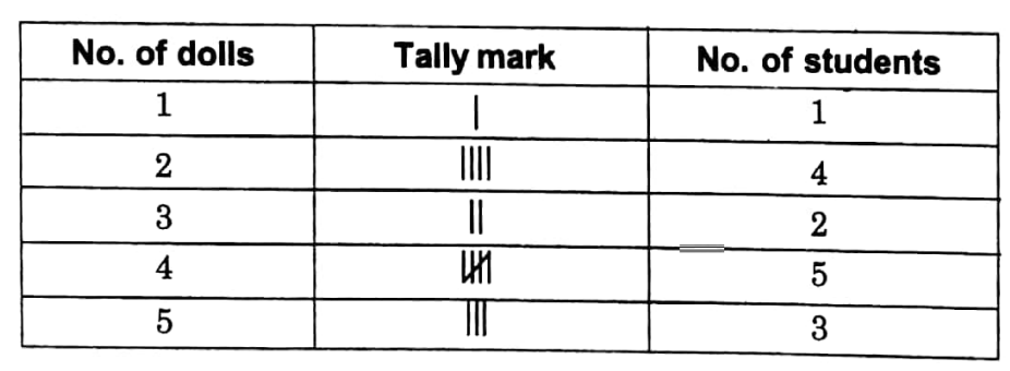
In the first column of the table, data pertaining to the number of dolls prepared are written from the lowest to the highest. Corresponding to the first value in the given raw data, a bar (or vertical line) is put in the second column opposite to it. Next, we see the second value in the given raw data and put a bar opposite to it in the second column. This process is repeated till all the observations in the given raw data are exhausted.
The bars drawn in the second column are known as tally marks. In general, we record tally marks in bunches of five, the fifth tally mark is drawn diagonally across the first four. For example, W = 8. Finally, the number of tally marks are counted corresponds to each observation and written in the third column. Representation by tally mark thus makes data easily understandable and clear.
Example 2
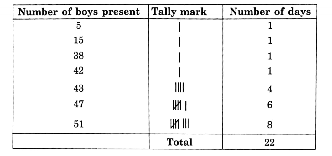
In a certain month, 22 days were denoted to academics in your school. You have written the number of boys present in those 22 days in your class.
They are :
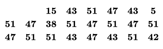
Prepare a frequency distribution chart with tally marks from this raw data:
Pie Chart
A pie chart is a pictorial representation of the numerical data by non-intersecting adjacent sectors of a circle such that the area of each sector is proportional to the magnitude of the data represented by the sector. The pie chart is very useful to express the relationships among different parts of data and also the relation between the whole data and a part of it.
In the pie chart to express the whole data, a complete circle is used. This circle is subdivided into sectors by radii in such a manner that the areas of different sectors are proportional to the values of the corresponding parts of data. Thus pie charts are very useful to show percentage breakdowns. For example, pie charts can depict various percentage shares of students of a school who like various activities like singing, dancing, recitation, drama, etc.
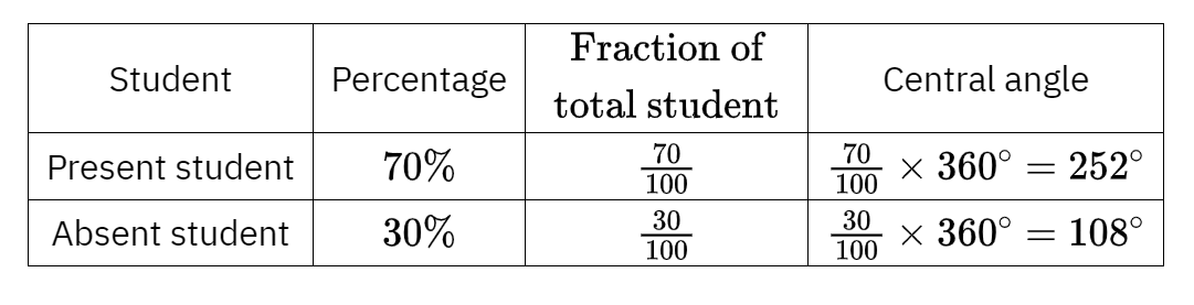
Example 1
On a particular day, 70% of the students of your school are present and 30% of students are absent. Then it can be expressed by pie chart as follows:

Examples of Data Representation Using Pie Charts
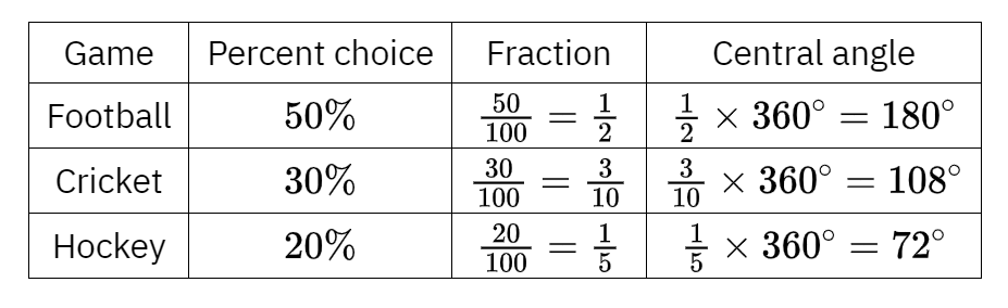
Example 2
50% students of in your class play football, 30% play cricket and 20% play hockey. It may be represented by a pie chart.

Let us briefly discuss the construction of a pie chart based on the above examples. The circle is divided into as many sectors as there are components in the data. Examples 1 and 2 have 2 and 3 component parts of data respectively. The area of each sector is proportional to the component value of the component (class) represented by the sector. But, we know that the area of a sector is proportional to the angle subtended at the center by its arc. Therefore, sector angles or central angles are proportional to the component values of the components (classes) represented by the sectors.
Thus, the central angle of a component
= (Value of the component (or %)/sum of the component values (or 100%) x 360°)
Finally, the descriptive labels shall be put either inside or beside each sector to make them easily identified. When completed, the entire graph or chart looks like a pie and the components resemble the slices cut from a pie.
2.7 Reading of Pie chart
The process of obtaining various information related to given data from the given pie chart is known as a reading of the pie chart.
The following formulae will be useful to find
the values of various computer nts of data from its pie chart:
Central angle for a component
= (Value of the component/sum of the component values x 360°)
or, Value of the component
= (Central angle for the component x Sum of the component values / 360°)
The percentage value of a component
(Central angle of the component / 360° x100)
Example 3
From the pie chart answer the questions:
The pie chart of which types of songs the audience likes to listen to:
1. What part of the total circular region is the sector of an audience of the folk song?
2. Write from the pie chart which type of song has the most number of listeners.
3. Write which type of song has the least number of listeners.
Solution:
1. The sector of audience of folk songs is = 20%
= 20/100 part
= 1/5 part of the folk song of the total circular region.
2. Audience of the modern songs is maximum.
3. The audience of the classical songs is minimal.

Example 4
From the pie chart answer the questions: The pie chart of what kind of programs the audience likes:
1. In the pie chart what part of the total circular region is the section of the audience who watch the news?
2. What kind of program gets the most audience?
3. What kind of program gets the least audience?
4. What part of the total audience watches the programs on sports?
Solution:
1. The sector of the audience who watch the news is the 20/360 part
= 1/18 total circular region.
2. Entertainment-based program gets the most audience.
3. Information Information News-based program gets the audience.
4. 90/360 part = 1/4 part of the total audience watching programs on sports.

Illustrative Examples on the PIE Chart
Example 5
The percentage of marks which Ram has secured on the total marks in the final examination of class VII is given below:
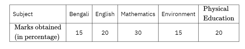
Prepare a pie chart of this information and write the central angle of each sector.
Solution:
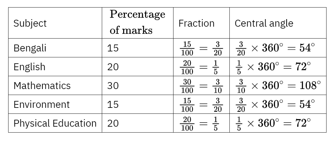
At first, a circle of any radius is drawn. Then constructing the radius OA,
∠AOB = 54°,
∠BOC= 72°,
∠COD = 108°,
∠DOE = 54°
and ∠EOA = 72° are drawn.

The produced is a pie chart of the given data.
Conceptual Questions on Pictographs and Pie Charts
Example 6
The list of various types of things which are sold in a shop of man for a particular day is as follows:
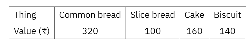
Draw a pie chart of this data.
Solution: Total sales on that day (320+ 100+ 160+ 140)=720.
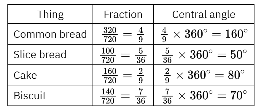
At first, a circle of any radius is drawn.
Then constructing the radius OA,
∠AOB = 160°,
∠BOC = 50°,
∠COD = 80°
and ∠DOA = 70° are drawn.
The figure produced is the pie chart of the given data.

Key Terms Related to Data Representation
Example 7
A list is made of things that the students of class VIII of both sections like to do during their leisure. (One student can like only one subject).
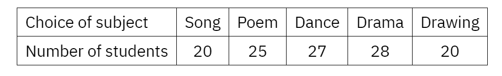
Work out from this data what parts of the total students like which subjects. Find the central angle of each sector and make a pie chart accordingly.
Solution: Here total number of students = (20+25+27 +28+ 20)
= 120
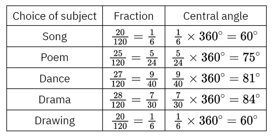
At first, a circle of any radius is drawn.
Then constructing the radius OA,
∠AOB = 60°,
∠BOC= 75°,
<COD = 81°,
∠DOE= 84°
and ∠EOA = 60° are drawn.
The produced is a pie chart of the given data.

Example 8
A pie chart is made by asking for the name of the favorite season for a group of 180 students. Answer the questions from the pie chart.
1. Which season is liked by most of the students and how many like it?
2. Which season is liked by the least number of students and how many like it?
3. How many students like summer?
4. How many students like spring?
5. Which season has been expressed by the least sector?
Solution:
1. Most of the students like winter = 180 x 40/100
= 72 students.
2. The least number of students during the rainy season = 180 x 10/100
= 18 students.
3. The number of students in summer is 180 x = x 20/100
= 36 students.
4. The number of students in spring = 180 x 30/100
= 54 students.

5. Rainy season has been expressed by the least sector.
Example 9
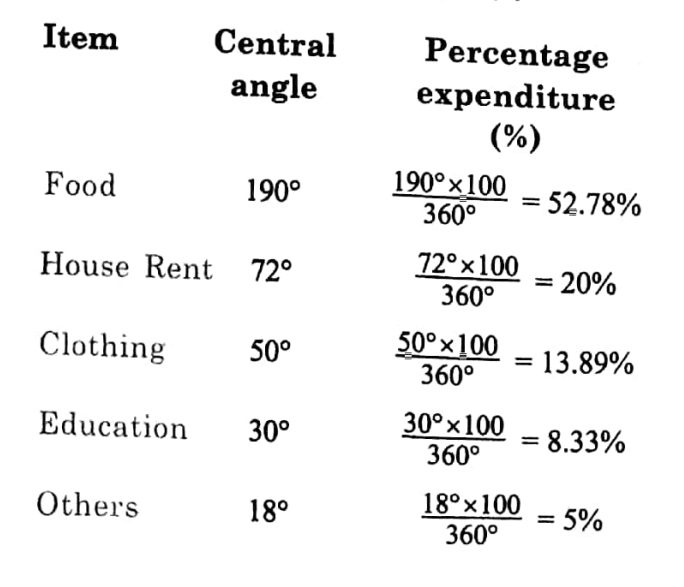
A pie chart is made representing the expenditures made by a family on different items in a certain month. Find the percentage expenditures on different items from the given pie chart.

Solution:
For this problem, the percentage expenditure made on an item
(Central angle of the corresponding sector / 360° x 100)
Using the above formula, percentage expenditures on various items are computed as shown in the table