
Arithmetic Chapter 7 Bar Graph Exercise 7 Solved Example Problems
When different data are represented by some bars then it is called a bar graph. You have seen the runs scored in different overs in a cricket match by means of bar graph in television. We shall discuss the application of bar graphs in different fields of society.
Example 1.
Let, the number of boys in your school from Class 6 to 9 be as follows :
Class 6 — 45 boys
Class 7 — 48 boys
Class 8 — 50 boys
Class 9 — 40 boys
Solution: This data may be represented as follows :
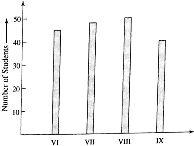
This way the pictorial representation of the numerical data by a number of bars (rectangles) of uniform width is called a bar graph. In the above example, the bar graph has been drawn following the undermentioned methods:
1. The classes of 6, 7, 8 and 9 are marked along the horizontal axis (X-axis) at uniform gaps.
2. Keeping in mind the maximum and minimum number of boys among the given classes, a suitable scale is chosen to determine the heights of the rectangles or bars that have been erected vertically along the vertical axis (Y-axis).
The given example shows that 1 scale division represents 10 boys between the origin (0-mark) and the 50 mark.
3. At last the number of boys in each class is drawn as bars (of equal width) corresponding to each class. The bars of different heights have equal spacing between them. Thus the bar graph is drawn completely.
Now the obvious question is what is the utility of bar graph or what do we come to know from a bar graph.
Read and Learn More WBBSE Solutions For Class 7 Maths
The information obtained from a bar graph may be stated as:
- Pictorial representation of data in the form of bars helps easy the understanding of data. This makes comparative analysis easier and which in turn facilitates the process of decision-making about future corrective actions, if any.
- The maximum and minimum values of obtained data and the range or the difference between these two values become clear in front of our eyes.
- This sort of data handling makes the computation of the average value of gathered data easier and more meaningful.
The above points related to the utilities of the bar graph will be more clear from the next example.
WBBSE Class 7 Bar Graph Solutions
Example 2. The bar graph of the boys of your school from class 5 to 8 in the year 2013 is given below
Solution:
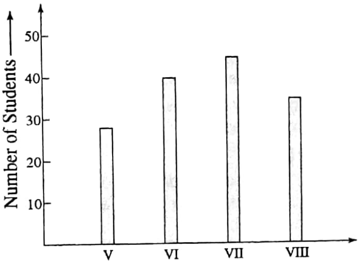
From the bar graph the following information are known:
1. In the year 2013, the number of boys of class 5 was nearly 30.
2. In the year 2013, the number of boys of class 6 was 40.
3. In the year 2013, the number of boys of class 7 was between 40 and 50.
4. In the year 2013, the number of boys of class 8 was between 30 and 40.

Double bar graph:
The simultaneous pictorial representation of two series of data using two bars drawn side by side following the same scale is known as a double bar graph.
Both the bars are shaded separately and the shading is usually shown in the top right corner of the graph paper.
Example 3. You obtained the following marks in different subjects In two consecutive tests.
| Subject | Bengali | English | Maths | History | Geography |
| 1st test | 72 | 85 | 86 | 85 | 90 |
| 2nd test | 80 | 77 | 90 | 80 | 85 |
Solution:
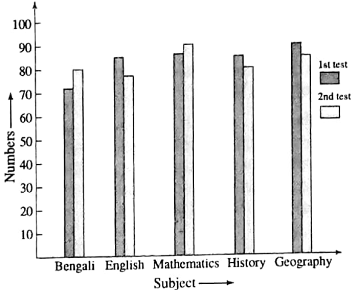
The most important utility of a double bar graph is that it gives us the opportunity to carry out fruitful comparative analysis of two series of data without elaborate mathematical computations.
The matter will be clear to you once you go through the following examples.
WBBSE Class 7 Arithmetic Bar Graph Examples
Example 4. In a Girls’ school participation of the girls in dance, singing and recitation is as follows:
| Activity | Dance | Singing | Recitation |
| Class 7 | 15 | 12 | 16 |
| Class 8 | 10 | 8 | 20 |
Represent the above data by a double bar graph and answer the following questions from the bar graph:
1. In which activity is the participation of girls of both classes 7 & 8 maximum?
2. In which activities have the students of class 7 participated in more number than those of class 8?
Solution:
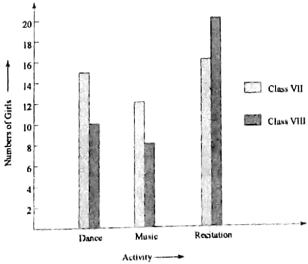
It is seen from the above double bar graph that:
1. Maximum participation of girls of both class 7 & 8 has occurred in recitation.
2. Students of class 7 have participated in both dance and music in more numbers than those of class 8.
Example 5. The production of motorcycles and cycles (in number) of four companies in the last 6 months is summarised hereunder:
| Company | 1st | 2nd | 3rd | 4th |
| Motor cycle(in No) | 8000 | 15,000 | 20,000 | 10,000 |
| Cycle(in No.) | 3000 | 5000 | 6000 | 4000 |
Represent the production figures with help of a double bar graph and give answers to the following questions :
1. Which company has produced the maximum number of motorcycles compared to that of cycles?
2. Which company has produced a minimum number of motorcycles compared to that of cycles?
3. Which company has produced the maximum number of motorcycles.
4. Which company has produced a minimum number of cycles.
Solution:
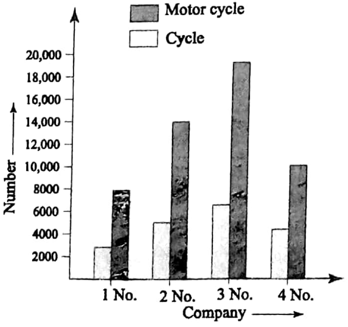
1. Company #3 has produced the maximum number of motorcycles compared to that of cycles.
2. Company #4 has produced a minimum number of motorcycles compared to that of cycles.
3. Company #3 has produced a maximum number of motorcycles.
4. Company #1 has produced a minimum number of cycles.
Class 7 Maths Exercise 7 Solved Examples
Example 6. The five-year production (in Ton) data of a state in connection with paddy and oil seeds is provided as below:
| Year | 2010 | 2011 | 2012 | 2013 | 2014 |
| Paddy(Ton.) | 210 | 200 | 195 | 210 | 180 |
| Oil seeds(Ton) | 85 | 110 | 115 | 120 | 125 |
Draw a double bar graph of the above data. Answer the following questions from the bar graph:
1. Which year has seen the minimum production of paddy?
2. In which two years the paddy productions are same?
3. In which year the production of oil seeds has been the maximum?
4. Which year has recorded the maximum production of paddy in comparison to that of oil seeds?
Solution:
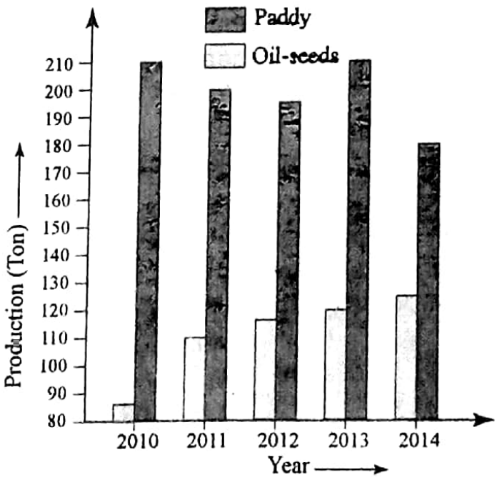
From the double bar graph we come to know that:
1. Production of paddy has been minimum in 2014.
2. Paddy productions are found to be the same in both 2010 and 2013
3. Maximum production of oil seeds has occurred in 2014.
4. The Year 2010 has recorded the maximum production of paddy in comparison to that of oil seeds.